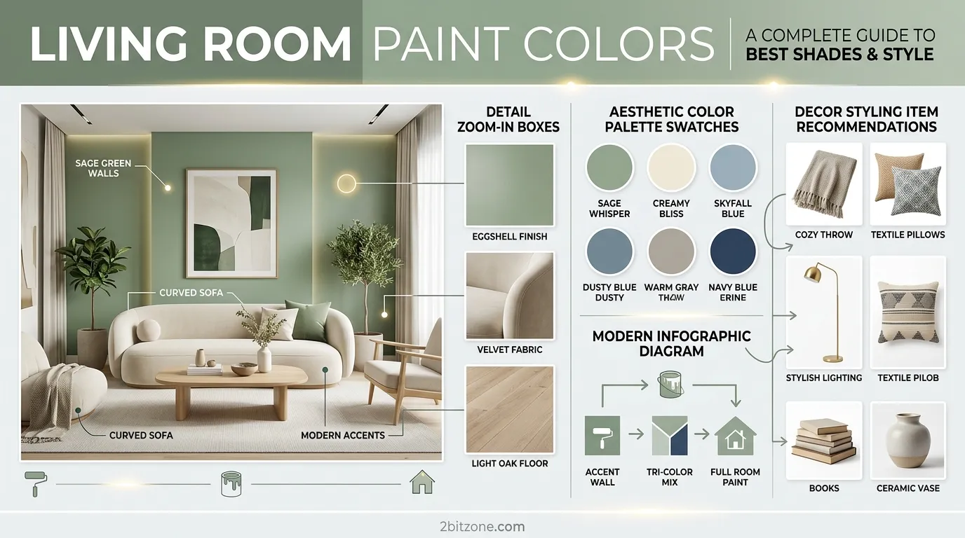
First, living room paint colors (which is a pretty overwhelming task). From thousands of shades, how do you choose the one that goes from blah to ahhh? Your living room is the center of your home: Where family comes together, visitors are welcomed, and where memories are created. But the wall color sets the whole tone. Choosing the wrong one can turn a doubly sized room into a shoebox, or leave you freezing in a lovingly cozy space.
The good news? No need for an interior designer to get this right. There is a perfect palette for every colour scheme for small spaces, tight budget or luxury look without the price tag. Here in this guide we will show you how the top 2026 living room paint colors are among most flattering, on purpose and evergreen. Browse rich earthy hues and airy neutrals to bold statements: shades that seamlessly translate into real homes—and not just Pinterest boards. So, make your living room so that you won’t ever want to leave it.
Why Choosing the Right Living Room Paint Colors is Important
Strangely, many of us pick a paint color last. In fact, your living room colors may be the first decision you make. Why? Because color psychology is real. Light blues and greens help reduce stress and heart rate—ideal for a soothing space. Warm beiges and terracottas create a feeling of coming together and connection. Black and navy provide drama and intimacy.
Beyond the mood of it, a great color will actually alter your perception in the room. Light, cool gray can make an 800 sq. ft. apartment remain light and airy. A rich emerald green can wrap a cavernous loft in warmth. In addition, paint is the most inexpensive renovation you will ever do. All of that can renew a home’s personality for less than $100. When you get your living room paint colors wrong, it is a waste of time, money and emotional energy. Nailing them, means returning home to a place that breathes.
25 living room paint colors
1. Organic Modern
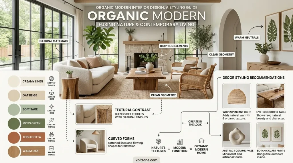
Warm, natural, and uncluttered. Organic modern living room paint colors bring the outdoors in with earthy neutrals and soft textures.
- Why It’s Trending: People are craving calm, screen-free spaces after years of digital overload.
- Why Homeowners Love Them: They feel warm but not messy, clean but not cold.
- Best Features: Pairs perfectly with wood, stone, and linen.
- Smart Features: Hides everyday dust and pet hair surprisingly well.
- Key Characteristics: Rounded shapes, natural light, no sharp contrasts.
- Main Design Elements: Curved sofas, jute rugs, clay pottery.
- Common Materials: Unfinished oak, limewash plaster, rattan.
- Best Colors: Warm white, mushroom taupe, sage green, clay beige.
- Popular Features: Accent arches, textured wall finishes.
- Styling Tips: Use the same color on walls and ceiling for a cocoon effect.
- Best Decor Pairings: Leather, wool throws, hand-thrown ceramics.
- Works Best With: Low-slung furniture and oversized plants.
- Best Room Match: Living rooms with large windows.
- Ideal Spaces: Open-concept homes, boho apartments.
- Perfect For: Homeowners wanting luxury without being flashy.
- Benefits: Low maintenance, timeless, increases resale appeal.
2. Quiet Luxury
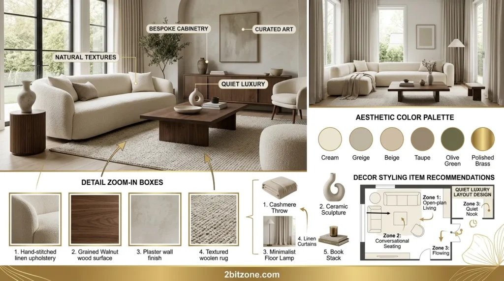
Understated elegance. Quiet luxury living room paint colors use muted, expensive-looking neutrals that whisper wealth.
- Why It’s Trending: “Stealth wealth” is in. Logos and bright colors are out.
- Why Homeowners Love Them: They look expensive without being loud or trendy.
- Best Features: Works with any architectural style from modern to traditional.
- Smart Features: Soft matte finishes hide wall imperfections.
- Key Characteristics: Tonal layering, no patterns, serene vibes.
- Main Design Elements: Floor-to-ceiling drapes, wool rugs, cashmere throws.
- Common Materials: Velvet, bouclé, brushed brass, travertine.
- Best Colors: Oatmeal, driftwood gray, dusty rose, butter yellow (muted).
- Popular Features: Picture molding painted the same color as walls.
- Styling Tips: Paint trim the exact same color as walls for a seamless look.
- Best Decor Pairings: Crystal lamps, silk pillows, antique mirrors.
- Works Best With: Plush seating and soft, directional lighting.
- Best Room Match: Formal living rooms or adult-only spaces.
- Ideal Spaces: Townhouses, high-rise condos, suburban retreats.
- Perfect For: Empty nesters, professionals, luxury renters.
- Benefits: Ageless, hotel-like feel, low visual clutter.
3. Coastal Grandmother
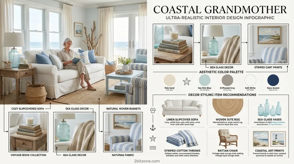
Breezy, classic, and comforting. Coastal grandmother living room paint colors feel like a New England summer home.
- Why It’s Trending: TikTok made it viral. Everyone wants Nancy Meyers’ kitchen.
- Why Homeowners Love Them: Relaxing without being childish or overly nautical.
- Best Features: Blue and white never goes out of style.
- Smart Features: Light colors bounce sunlight around dark corners.
- Key Characteristics: Wicker, hydrangeas, slipcovered sofas.
- Main Design Elements: White beadboard, oversized lanterns, driftwood accents.
- Common Materials: Linen, cotton rope, seagrass, white oak.
- Best Colors: Cloud white, Wedgwood blue, seafoam, sand dollar.
- Popular Features: Beadboard wainscoting painted glossy white.
- Styling Tips: Use a pale blue on walls and crisp white on trim.
- Best Decor Pairings: Blue-and-white pottery, rope baskets, oyster shells.
- Works Best With: Messy buns, iced tea, and open windows.
- Best Room Match: Living rooms with fireplaces or window seats.
- Ideal Spaces: Beach houses, suburban colonials, farmhouses.
- Perfect For: Grandmothers, and anyone who wishes they had one.
- Benefits: Instantly calming, photogenic, easy to shop for.
4. Dark & Moody
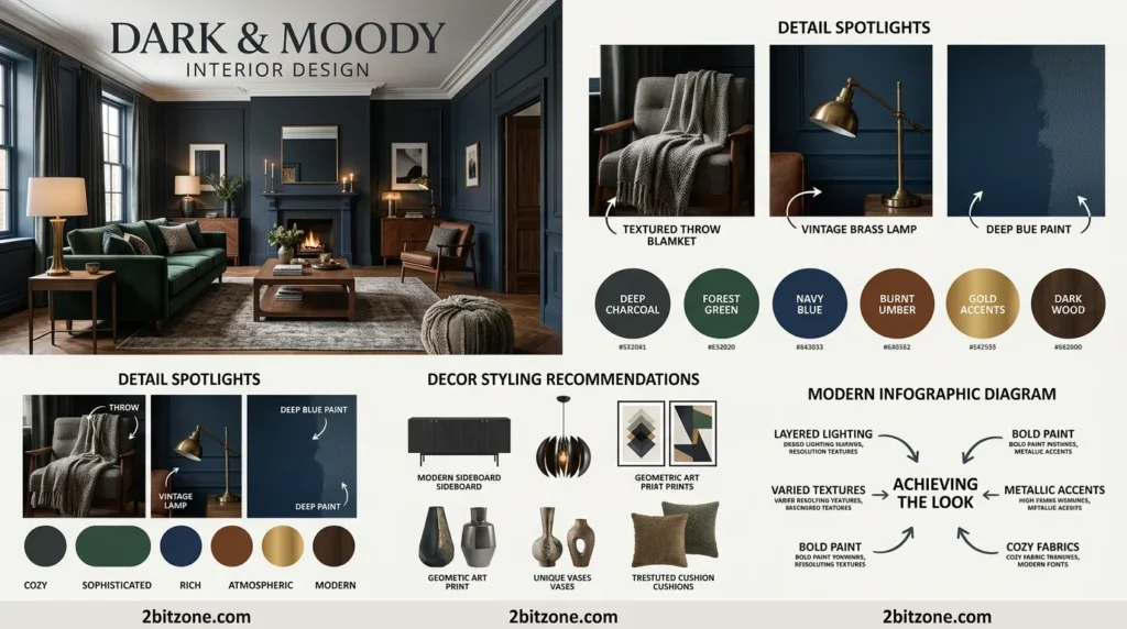
Dramatic, intimate, and bold. Dark moody living room paint colors turn your space into a cozy den after sunset.
- Why It’s Trending: People are embracing “lighting design” instead of just white walls.
- Why Homeowners Love Them: Makes a large room feel warm and a small room feel like a jewel box.
- Best Features: Hides stains, fingerprints, and toddler art better than any other palette.
- Smart Features: Dark walls make artwork and gold frames pop dramatically.
- Key Characteristics: Low light, velvet textures, layered lamps.
- Main Design Elements: Tufted sofas, brass sconces, Persian rugs.
- Common Materials: Leather, dark oak, wrought iron, marble.
- Best Colors: Charcoal, midnight blue, forest green, black-brown.
- Popular Features: A single dark accent wall behind the TV (hides the black screen).
- Styling Tips: Use semi-gloss on dark colors to reflect what little light you have.
- Best Decor Pairings: Gold frames, crystal decanters, cream candles.
- Works Best With: Dimmable recessed lighting and table lamps.
- Best Room Match: Windowless living rooms or basement dens.
- Ideal Spaces: Row homes, man caves, winter cabins.
- Perfect For: Movie lovers, night owls, introverts.
- Benefits: Extra cozy, hides flaws, makes TV time better.
5. Retro 70s
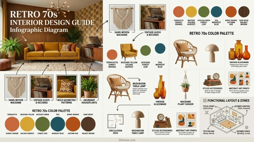
Funky, warm, and unapologetic. Retro 70s living room paint colors bring back harvest gold and avocado with a modern twist.
- Why It’s Trending: Gen Z and Millennials are raiding their grandparents’ basements.
- Why Homeowners Love Them: It’s fun, not serious. A break from beige.
- Best Features: Bold colors make small spaces feel intentional, not cramped.
- Smart Features: Terra cotta tones hide red wine spills like a dream.
- Key Characteristics: Shag rugs, sunburst mirrors, conversation pits.
- Main Design Elements: Curved sectional, floor lamps, macrame.
- Common Materials: Plastic laminate, chrome, velvet, teak.
- Best Colors: Burnt orange, mustard yellow, olive green, chocolate brown.
- Popular Features: Two-tone walls (dark bottom, light top).
- Styling Tips: Paint only one wall in a bold 70s color; keep others neutral.
- Best Decor Pairings: Lava lamps, vintage posters, ceramic mushrooms.
- Works Best With: Low-profile furniture and lots of plants.
- Best Room Match: Dens, rec rooms, first apartments.
- Ideal Spaces: Renovated ranch homes, vintage trailers.
- Perfect For: Thrifters, musicians, maximalists.
- Benefits: Unique, conversation-starting, budget-friendly (thrift stores love it).
6. Minimalist Japandi
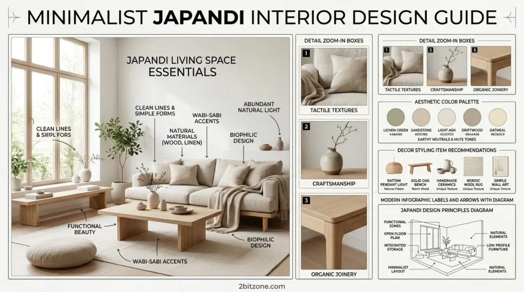
Where Japanese simplicity meets Scandinavian coziness. Japandi living room paint colors are muted, balanced, and deeply peaceful.
- Why It’s Trending: The perfect fusion of two beloved aesthetics—less clutter, more warmth.
- Why Homeowners Love Them: Low visual noise = low mental stress.
- Best Features: Works in tiny apartments and huge lofts equally well.
- Smart Features: Pale, warm grays don’t show dust as much as pure white.
- Key Characteristics: Asymmetry, negative space, natural light.
- Main Design Elements: Sliding shoji screens, paper lanterns, knotty pine.
- Common Materials: Bamboo, washi paper, raw linen, clay.
- Best Colors: Rice paper white, stone gray, matcha tea green, ink black (sparingly).
- Popular Features: A single black accent line (window trim or a shelf).
- Styling Tips: Keep sheen matte. No glossy finishes in Japandi.
- Best Decor Pairings: Bonsai, handmade pottery, sumi-e art.
- Works Best With: Floor cushions and low-slung tables.
- Best Room Match: Meditation corners or reading nooks.
- Ideal Spaces: Studio apartments, zen dens, tiny homes.
- Perfect For: Overstimulated parents, freelancers, yogis.
- Benefits: Freeing, easy to clean, incredibly photogenic.
7. Grand Millennial
Chintzy, cheerful, and nostalgic. Grand Millennial living room paint colors mix old-fashioned florals with fresh, happy hues.
- Why It’s Trending: Millennials want the charm of their grandma’s house, but updated.
- Why Homeowners Love Them: It’s optimistic and colorful without being childish.
- Best Features: Pastels and chintz hide the fact that your sofa is ten years old.
- Smart Features: Light blues and pinks make windowless rooms feel airy.
- Key Characteristics: Ruffles, china cabinets, needlepoint pillows.
- Main Design Elements: Tufted settee, bow armchair, pleated lampshades.
- Common Materials: Chintz, brass, porcelain, velvet ribbon.
- Best Colors: Powder blue, blush pink, butter yellow, celery green.
- Popular Features: A floral wallpaper accent wall with coordinating trim paint.
- Styling Tips: Paint your ceiling a soft pink or blue for a “porch effect.”
- Best Decor Pairings: Needlepoint, crystal candy dishes, family photos.
- Works Best With: Mix of high and low (antiques + IKEA).
- Best Room Match: Sunrooms or formal living rooms.
- Ideal Spaces: Suburban tract homes, inherited family houses.
- Perfect For: Sentimental collectors, English cottage lovers.
- Benefits: Cheerful, nostalgic, easy to thrift for.
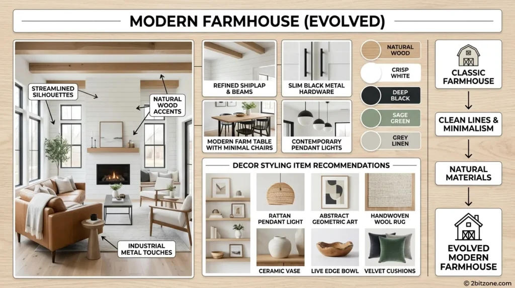
8. Modern Farmhouse (Evolved)
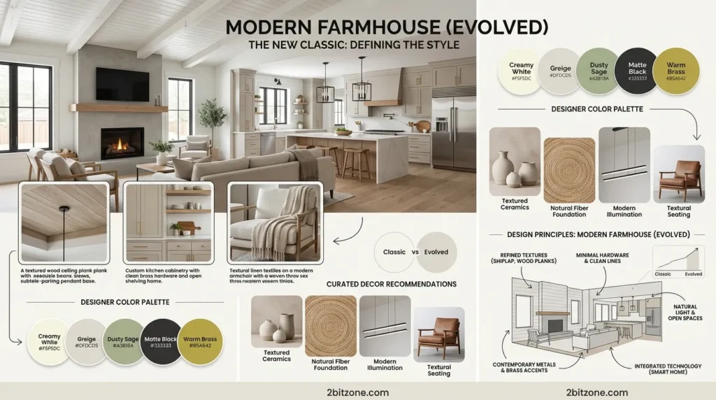
Not the fixer-upper look. Evolved modern farmhouse living room paint colors lean warmer, darker, and more sophisticated.
- Why It’s Trending: People got tired of “greige.” Now it’s creamy, deep, and rich.
- Why Homeowners Love Them: Still family-friendly but looks more expensive.
- Best Features: Deep, warm neutrals hide muddy paw prints.
- Smart Features: Eggshell finish on walls resists kids’ sticky fingers.
- Key Characteristics: Shiplap (but painted warm white), exposed beams, apron sink.
- Main Design Elements: Barn door (less frequent), leather sofa, kilim rug.
- Common Materials: Reclaimed wood, galvanized metal, slate, cotton.
- Best Colors: Alabaster white, iron ore black (accents), taupe, dried thyme green.
- Popular Features: Contrasting trim (white walls, black windows).
- Styling Tips: Paint your ceiling a warm beige to lower visual height.
- Best Decor Pairings: Galvanized buckets, linen drapes, cowhide.
- Works Best With: Slipcovered sofas and oversized clocks.
- Best Room Match: Great rooms with vaulted ceilings.
- Ideal Spaces: Rural homes, suburban developments, cabins.
- Perfect For: Families with pets, DIY renovators.
- Benefits: Durable, forgiving, easy to resell.
9. Urban Industrial
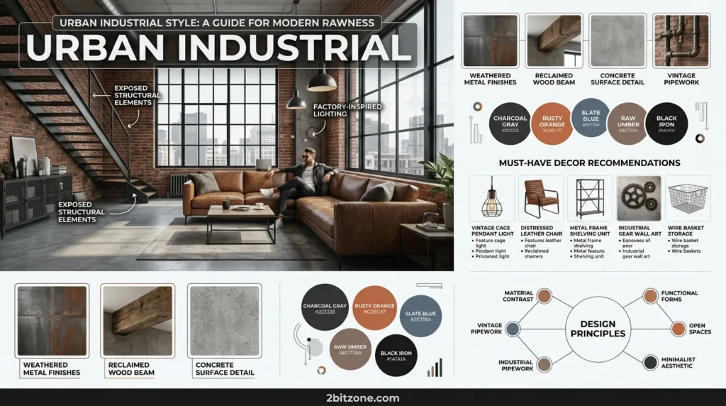
Raw, edgy, and cool. Urban industrial living room paint colors use grays, blacks, and whites to highlight exposed architecture.
- Why It’s Trending: More people are living in converted lofts and warehouses.
- Why Homeowners Love Them: Low-maintenance and looks better slightly worn.
- Best Features: Dark grays make ductwork and pipes disappear.
- Smart Features: Concrete-look paint hides cracks and flaws.
- Key Characteristics: Exposed brick, steel beams, concrete floors.
- Main Design Elements: Leather Chesterfield, metal shelving, factory pendants.
- Common Materials: Iron, distressed leather, plywood, glass block.
- Best Colors: Cool gray, charcoal, pitch black, chalk white.
- Popular Features: A single red-or brick accent wall (real or faux).
- Styling Tips: Use high-gloss white on trim to contrast with flat gray walls.
- Best Decor Pairings: Vintage signs, metal lockers, Edison bulbs.
- Works Best With: Open floor plans and floor-to-ceiling windows.
- Best Room Match: Lofts, basements, man caves.
- Ideal Spaces: City apartments, converted schools, garages-turned-homes.
- Perfect For: Bachelors, artists, minimalists with edge.
- Benefits: Tough, stylish, easy to clean.
10. Romantic Bohemian
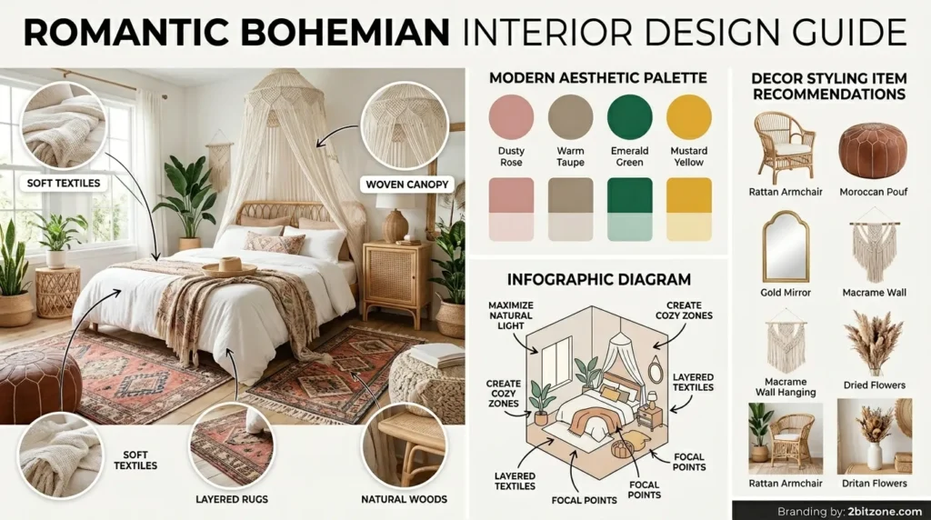
Soft, layered, and free-spirited. Romantic boho living room paint colors use dusty pastels and warm earth tones.
- Why It’s Trending: Maximalism is back, but make it soft and dreamy.
- Why Homeowners Love Them: No rules—more is more.
- Best Features: Faded, dusty colors hide wear and tear beautifully.
- Smart Features: Mauve and dusty rose hide red wine stains (science!).
- Key Characteristics: Layered rugs, fringe, tassels, canopy drapes.
- Main Design Elements: Floor cushions, hanging chair, gallery wall.
- Common Materials: Velvet, macrame, rattan, silk, feathers.
- Best Colors: Dusty rose, faded lavender, warm terracotta, cream.
- Popular Features: A painted arch or mural behind the sofa.
- Styling Tips: Use three different paint colors on contiguous walls for depth.
- Best Decor Pairings: Moroccan poufs, dreamcatchers, vintage quilts.
- Works Best With: Low lighting and lots of plants.
- Best Room Match: Bedrooms or sun-drenched living rooms.
- Ideal Spaces: Studio apartments, attic conversions, RVs.
- Perfect For: Artists, travelers, free spirits.
- Benefits: Expressive, comfortable, one-of-a-kind.
11. Mediterranean Revival
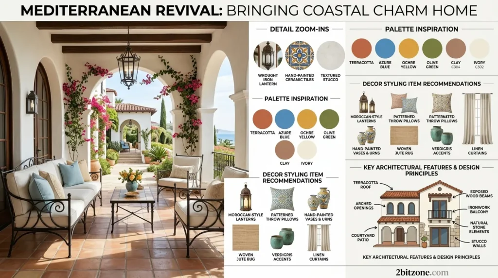
Sunbaked, warm, and earthy. Mediterranean living room paint colors bring the Spanish coast into your home.
- Why It’s Trending: “Old world” charm is replacing cold modernism.
- Why Homeowners Love Them: Makes any house feel like a vacation rental.
- Best Features: Terracotta and ochre make north-facing rooms feel sunny.
- Smart Features: Sandy neutrals don’t show dust from open windows.
- Key Characteristics: Arches, wrought iron, clay tile floors.
- Main Design Elements: Plaster walls, carved wood furniture, lanterns.
- Common Materials: Clay, terracotta, hand-painted tile, wrought iron.
- Best Colors: Terracotta, ochre, deep navy (for contrast), warm white.
- Popular Features: A painted “rug” effect on concrete floors.
- Styling Tips: Use limewash paint for that authentic mottled texture.
- Best Decor Pairings: Blue-and-white tile, olive branches, leather.
- Works Best With: Heavy wood beams and arched doorways.
- Best Room Match: Living rooms with fireplaces or courtyard access.
- Ideal Spaces: California bungalows, Florida homes, Arizona ranches.
- Perfect For: Hosts who love dinner parties.
- Benefits: Inviting, timeless, excellent for entertaining.
12. Hollywood Regency
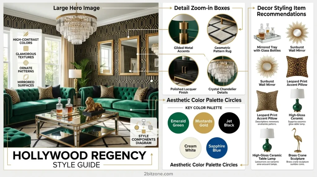
Glamorous, bold, and dramatic. Hollywood Regency living room paint colors use high-contrast, glossy jewel tones.
- Why It’s Trending: People want escapism and old-school glamour.
- Why Homeowners Love Them: Instant dopamine hit every time you walk in.
- Best Features: High-gloss finishes reflect light and make rooms feel bigger.
- Smart Features: Dark, glossy walls are surprisingly easy to wipe clean.
- Key Characteristics: Chinoiserie, tufting, mirrored furniture.
- Main Design Elements: Lacquered walls, crystal chandeliers, zebra rug.
- Common Materials: Lacquer, brass, mirrored glass, velvet, marble.
- Best Colors: Emerald green, sapphire blue, jet black (glossy), stark white.
- Popular Features: A high-gloss ceiling in a contrasting color.
- Styling Tips: Use semi-gloss or high-gloss on walls for full effect.
- Best Decor Pairings: Palm fronds, bamboo frames, animal print.
- Works Best With: Dramatic lighting and oversized art.
- Best Room Match: Formal living rooms or home bars.
- Ideal Spaces: Penthouses, mansions, glam apartments.
- Perfect For: Entertainers, creatives, maximalists.
- Benefits: Unforgettable, photogenic, feels like a set.
13. Cottagecore
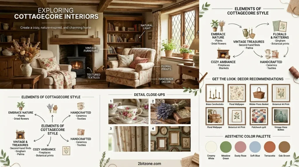
Whimsical, nostalgic, and soft. Cottagecore living room paint colors look like they were faded by 100 years of English sun.
- Why It’s Trending: A gentle escape from the digital, fast-paced world.
- Why Homeowners Love Them: Forgiving, romantic, and cozy.
- Best Features: Chalky, muted colors hide imperfections.
- Smart Features: Flat matte finish absorbs light for a softer room.
- Key Characteristics: Wildflowers, baking, embroidery, thatched roofs (vibe).
- Main Design Elements: Overstuffed floral sofa, apron table, drying herbs.
- Common Materials: Linen, unstained wood, pottery, canvas.
- Best Colors: Sage green, cream, lavender gray, dove blue.
- Popular Features: Hand-painted floral trim or stenciled borders.
- Styling Tips: Distress your painted trim with light sanding.
- Best Decor Pairings: Mismatched china, baskets, dried flowers.
- Works Best With: Leaded glass windows and stone floors.
- Best Room Match: Sunrooms or breakfast nooks.
- Ideal Spaces: Stone cottages, rural farmhouses, hobby farms.
- Perfect For: Gardeners, bakers, romantics.
- Benefits: Soothing, nostalgic, very “hygge.”
14. Eclectic Maximalist
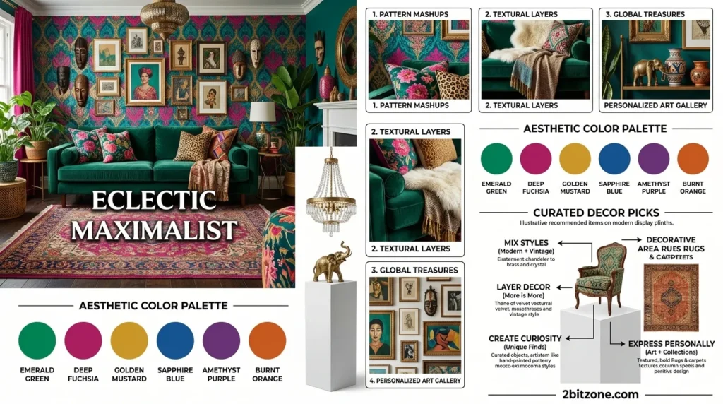
Bold, layered, and fearless. Eclectic maximalist living room paint colors use multiple saturated hues in one space.
- Why It’s Trending: Beige fatigue is real. Color is therapy.
- Why Homeowners Love Them: You can finally use ALL your favorite things.
- Best Features: No matching required. Chaos is the goal.
- Smart Features: A dark background color makes a rainbow of objects look cohesive.
- Key Characteristics: Gallery walls, pattern mixing, collections on display.
- Main Design Elements: Mismatched chairs, global textiles, floor cushions.
- Common Materials: Velvet, silk, wool, ceramic, wicker, glass.
- Best Colors: Jewel tones + a neutral anchor (e.g., peacock blue, fuchsia, plus beige).
- Popular Features: A different color on every wall (yes, really).
- Styling Tips: Paint the ceiling the darkest color to ground the chaos.
- Best Decor Pairings: Souvenirs, books, masks, neon signs.
- Works Best With: White or neutral sofas (let the walls be wild).
- Best Room Match: Living rooms that are “collection” spaces.
- Ideal Spaces: Artist lofts, row homes, eccentric estates.
- Perfect For: Collectors, travelers, extroverts.
- Benefits: Joyful, unique, tells your story.
15. Scandinavian
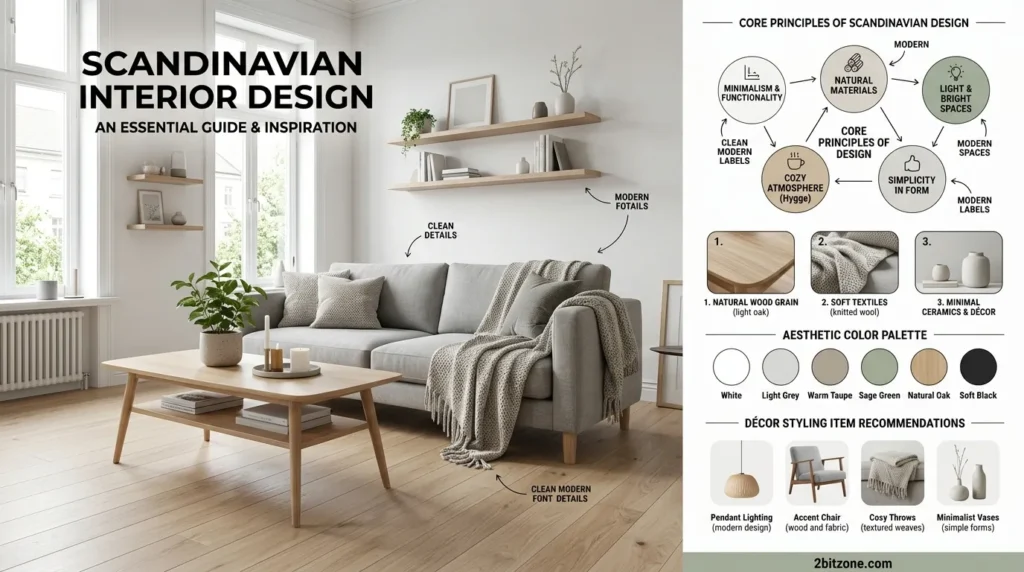
Meta Description: Bright, airy, and functional. Scandinavian living room paint colors are mostly white with one soft, nature-inspired accent.
- Why It’s Trending: The most copied aesthetic on Pinterest for a decade running.
- Why Homeowners Love Them: Makes small, dark rooms feel huge and bright.
- Best Features: White walls act as a canvas for changing decor.
- Smart Features: High-reflectance whites cut down on need for electric lighting.
- Key Characteristics: Hygge, lagom, functional furniture, candlelight.
- Main Design Elements: Wooden toys, sheepskin throws, simple shelving.
- Common Materials: Pale pine, wool, paper cord, glass.
- Best Colors: Pure white, pale gray, sky blue (muted), birch wood tone.
- Popular Features: A single pastel-colored accent wall behind the sofa.
- Styling Tips: Use white on walls and ceiling, but warm it up with wood floors.
- Best Decor Pairings: Candle holders, woven baskets, abstract prints.
- Works Best With: Natural light and minimal window treatments.
- Best Room Match: Small apartments or north-facing rooms.
- Ideal Spaces: City condos, arctic circle cabins, nurseries.
- Perfect For: Budget renovators, first-time homeowners.
- Benefits: Cheap (white paint is cheapest), timeless, resell-friendly.
16. Southwestern
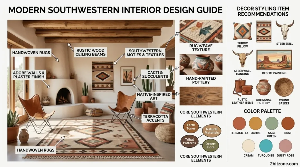
Warm, earthy, and rooted. Southwestern living room paint colors draw from desert landscapes and adobe architecture.
- Why It’s Trending: People love “desert modern” as a warmer alternative to minimalism.
- Why Homeowners Love Them: Deep, warm tones feel protective and grounding.
- Best Features: Rich reds and oranges add instant coziness to big, echoey rooms.
- Smart Features: Sandy neutrals hide dust in dry climates.
- Key Characteristics: Vigas (wood beams), kiva fireplace, coyote motifs.
- Main Design Elements: Leather pouf, woven wall hanging, clay ollas.
- Common Materials: Unpolished turquoise, raw wood, rawhide, adobe.
- Best Colors: Adobe pink, turquoise, cactus green, burnt sienna.
- Popular Features: Textured “slap” or stucco-effect paint finish.
- Styling Tips: Use a warm terra cotta on the ceiling to “lower” a tall adobe room.
- Best Decor Pairings: Pendleton blankets, horse hair pottery, cow skulls.
- Works Best With: Saltillo tile floors and exposed beams.
- Best Room Match: Sun-drenched living rooms with western exposure.
- Ideal Spaces: Arizona, New Mexico, Texas homes, or anywhere sunny.
- Perfect For: Nature lovers, equestrians, spiritual seekers.
- Benefits: Grounding, unique regionally, great with plants.
17. Art Deco Revival
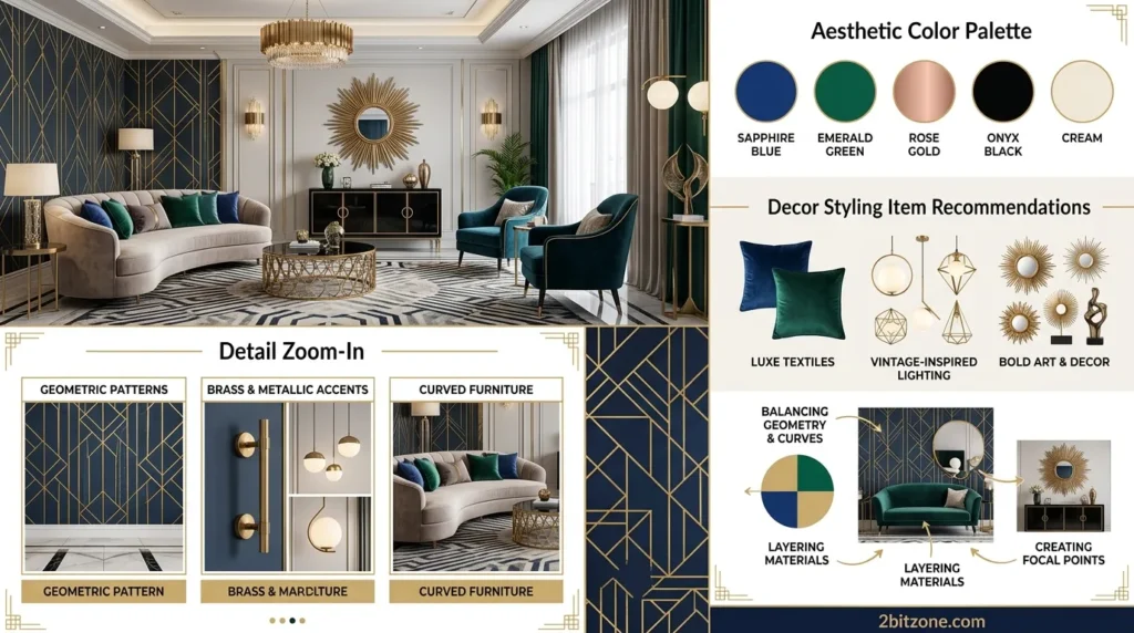
Geometric, opulent, and roaring. Art Deco living room paint colors use black, white, gold, and bold jewel accents.
- Why It’s Trending: The Great Gatsby aesthetic never dies; it just waits 100 years.
- Why Homeowners Love Them: Instantly elevates a boring apartment to glamorous.
- Best Features: High-contrast patterns can be painted, not wallpapered.
- Smart Features: Glossy black trim hides scuffs better than white.
- Key Characteristics: Sunbursts, chevrons, stepped arches, fans.
- Main Design Elements: Mirrored bar cart, velvet chaise, lacquered cabinets.
- Common Materials: Ebony, chrome, shagreen, smoked glass.
- Best Colors: Black and white (base), plus gold, emerald, or ruby accents.
- Popular Features: Painted geometric stripes on a single accent wall.
- Styling Tips: Use painter’s tape to create chevron or fan patterns in metallic paint.
- Best Decor Pairings: Ostrich feathers, crystal decanters, brass bookends.
- Works Best With: Symmetrical furniture placement.
- Best Room Match: Formal living rooms or home theaters.
- Ideal Spaces: Penthouses, metropolitan apartments, Gatsby-themed homes.
- Perfect For: Hosts, gamblers (aesthetic), vintage lovers.
- Benefits: Dramatic, Instagram-worthy, surprisingly modern.
18. Biophilic Green
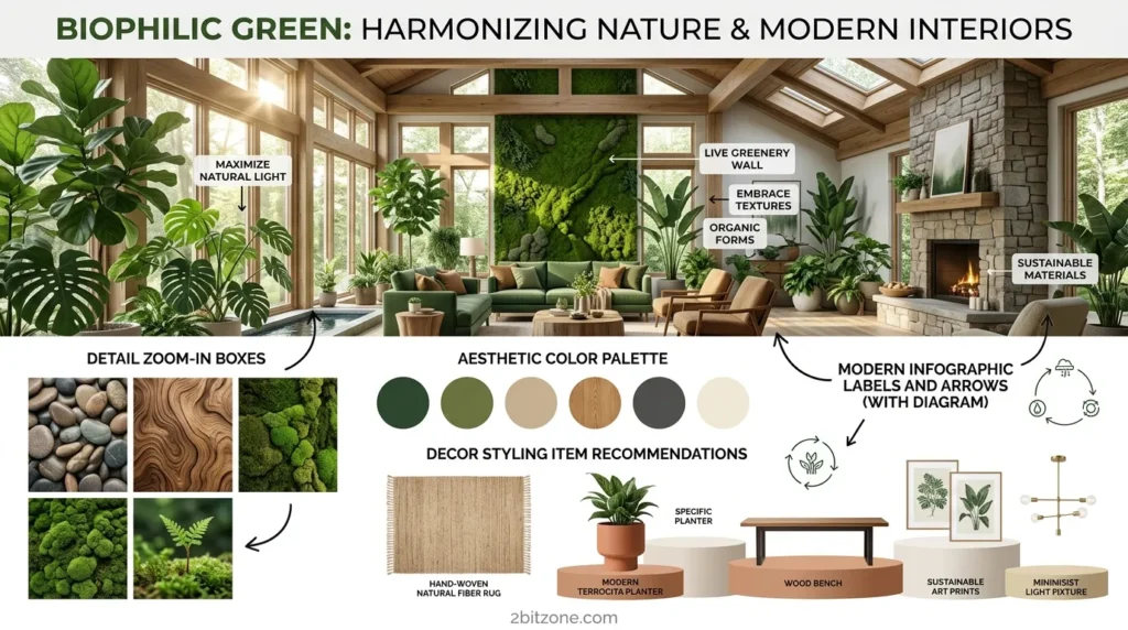
Nature-first and calming. Biophilic living room paint colors focus on every shade of green found in a forest.
- Why It’s Trending: Proven science: green reduces stress and improves focus.
- Why Homeowners Love Them: Makes your living room feel like a treehouse.
- Best Features: Green is neutral in biophilic design—it goes with everything.
- Smart Features: Darker greens hide dust and toddler handprints.
- Key Characteristics: Living walls, natural light, organic shapes.
- Main Design Elements: Indoor trees, moss art, water features.
- Common Materials: Live edge wood, stone, cork, recycled glass.
- Best Colors: Moss green, eucalyptus, olive, deep forest.
- Popular Features: An entire wall painted to look like a shadow of trees.
- Styling Tips: Use three different shades of green on adjacent walls.
- Best Decor Pairings: Real plants, terrariums, wood slice side tables.
- Works Best With: Huge windows or skylights.
- Best Room Match: Living rooms that face a garden.
- Ideal Spaces: Suburban homes, treehouses, wellness centers.
- Perfect For: Plant parents, remote workers, anxious minds.
- Benefits: Reduces eye strain, lowers blood pressure, increases happiness.
19. Rustic Cabin
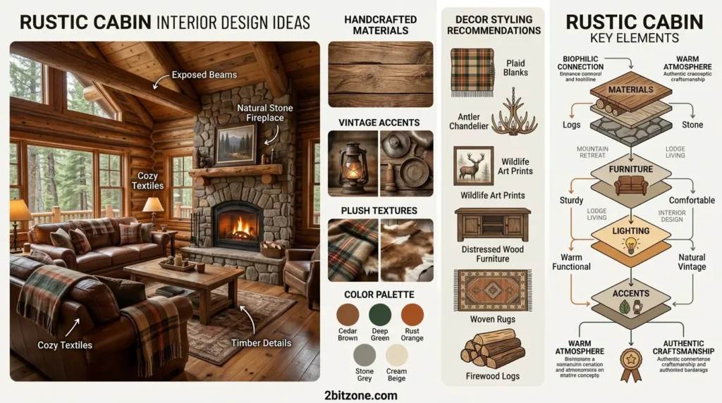
Rugged, warm, and woodsy. Rustic cabin living room paint colors use deep browns, warm grays, and forest greens.
- Why It’s Trending: Post-pandemic, people want cozy, protective “nested” spaces.
- Why Homeowners Love Them: Extremely forgiving. Dirt and wear add character.
- Best Features: Dark colors make industrial fireplace inserts disappear.
- Smart Features: Flat paint on logs hides cracks and settling.
- Key Characteristics: Stacked stone, exposed logs, antler chandeliers.
- Main Design Elements: Plaid sofa, bear rug (faux), woodstove.
- Common Materials: Rough-sawn lumber, slate, flannel, cast iron.
- Best Colors: Timber brown, pine green, storm gray, cream (trim).
- Popular Features: Two-tone walls (logs stained dark, drywall painted light).
- Styling Tips: Paint the ceiling a dark brown to make the room feel lower and cozier.
- Best Decor Pairings: Wool blankets, fishing lures, birch logs.
- Works Best With: Heavy beams and stone hearths.
- Best Room Match: Great rooms with cathedral ceilings.
- Ideal Spaces: Mountain cabins, lake houses, basements.
- Perfect For: Hunters, hikers, cold-weather lovers.
- Benefits: Durable, warm, perfect for entertaining in winter.
20. Wabi-Sabi
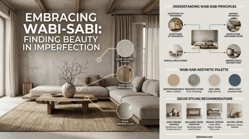
Imperfect, natural, and transient. Wabi-Sabi living room paint colors celebrate cracks, asymmetry, and muted earth tones.
- Why It’s Trending: A reaction to perfect, sterile, Instagram-ready rooms.
- Why Homeowners Love Them: No pressure to keep things pristine.
- Best Features: Chalky, uneven paint finishes are a feature, not a bug.
- Smart Features: Limewash paint actually looks better when it’s uneven.
- Key Characteristics: Handmade pottery, raw silk, uneven edges.
- Main Design Elements: Low platform bed, single branch in a vase, kintsugi.
- Common Materials: Clay, hemp, raw linen, reclaimed wood.
- Best Colors: Unbleached white, clay gray, moss, iron oxide red (sparingly).
- Popular Features: A “missing” piece of trim or intentionally unfinished edge.
- Styling Tips: Don’t patch small nail holes. Let the wall tell its story.
- Best Decor Pairings: A single wildflower, handmade bowl, cracked pot.
- Works Best With: Natural light and open, uncluttered floors.
- Best Room Match: Meditation rooms or minimalist living spaces.
- Ideal Spaces: Old farmhouses, Japanese-style homes, artist studios.
- Perfect For: Philosophers, potters, anti-consumerists.
- Benefits: Zero maintenance, deeply peaceful, spiritually grounding.
21. Neo-Memphis
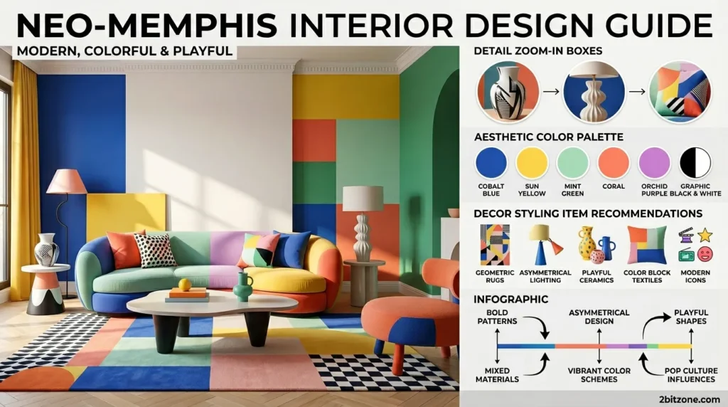
Loud, playful, and postmodern. Neo-Memphis living room paint colors use primary colors, pastels, and black-and-white squiggles.
- Why It’s Trending: Gen Z loves the irony and energy of 80s postmodernism.
- Why Homeowners Love Them: Pure joy. Impossible to be sad in this room.
- Best Features: Color blocking can hide awkward architectural features.
- Smart Features: High-contrast colors distract from a lack of natural light.
- Key Characteristics: Squiggles, grids, triangles, plastic laminate.
- Main Design Elements: Abstract shelving, floor lamp with colored balls, bubblegum pink chair.
- Common Materials: Plastic, terrazzo, neon, chrome, primary-colored wood.
- Best Colors: Crayon red, pool blue, bubblegum pink, banana yellow, plus black & white.
- Popular Features: Color-blocked geometric shapes painted directly on walls.
- Styling Tips: Use painter’s tape to mask off hard-edged geometric color blocks.
- Best Decor Pairings: Rubik’s cubes, arcade games, postmodern clocks.
- Works Best With: White or gray flooring to ground the chaos.
- Best Room Match: Game rooms or creative home offices.
- Ideal Spaces: Studio apartments, influencer content houses, teen bedrooms.
- Perfect For: Graphic designers, gamers, energetic extroverts.
- Benefits: Energizing, unique, pure self-expression.
22. French Country
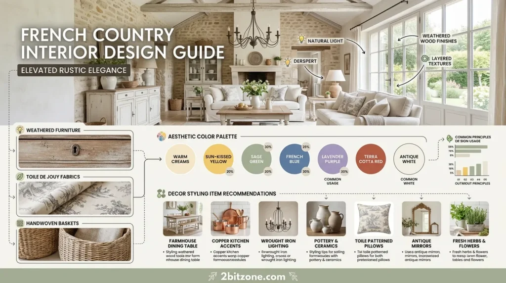
Elegant, rustic, and soft. French country living room paint colors use warm grays, lavender, and butter yellow.
- Why It’s Trending: A softer alternative to farmhouse—more romance, less shiplap.
- Why Homeowners Love Them: Timeless elegance without being stuffy.
- Best Features: Warm, dusty colors make antique furniture look intentional.
- Smart Features: Distressed faux finishes hide real wear and tear.
- Key Characteristics: Molding, linen, lavender bundles, roosters (tasteful).
- Main Design Elements: Bergère chairs, armoire, farm table, tole trays.
- Common Materials: Limestone, oak, toile fabric, terracotta.
- Best Colors: French gray, lavender, butter yellow, cream, sage.
- Popular Features: Faux marble painting or trompe l’oeil on walls.
- Styling Tips: Use a glaze technique to “age” your painted walls.
- Best Decor Pairings: Ironstone pitchers, herb wreaths, apothecary jars.
- Works Best With: Stone floors and exposed beams.
- Best Room Match: Living rooms with a fireplace and large windows.
- Ideal Spaces: Country estates, suburban colonials, winery homes.
- Perfect For: Romantics, cooks, antique collectors.
- Benefits: Gracious, welcoming, impressive to guests.
23. Post-Modern Pastel
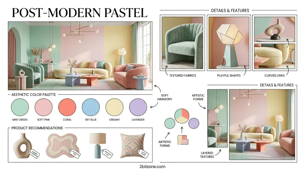
Soft shapes, softer colors. Post-modern pastel living room paint colors use baby pinks, mint greens, and lilacs on curved walls.
- Why It’s Trending: The “clean girl” aesthetic meets 80s nostalgia.
- Why Homeowners Love Them: Soft, soothing, but still playful.
- Best Features: Pastels bounce light better than whites in some cases.
- Smart Features: Mint green reduces eye strain for TV watching.
- Key Characteristics: Curved sofas, arches, cloud mirrors, checkerboard.
- Main Design Elements: Bubble chandelier, acrylic furniture, wavy mirrors.
- Common Materials: Velvet, frosted glass, acrylic, bouclé.
- Best Colors: Pepto pink, mint chip, lilac, baby blue, butter yellow.
- Popular Features: An arched alcove painted a contrasting pastel.
- Styling Tips: Paint your door frames and baseboards pastel too (no white trim).
- Best Decor Pairings: Swirl candles, shell pillows, bubblegum machines.
- Works Best With: Curved furniture and fluffy rugs.
- Best Room Match: Sun-drenched living rooms or “girl cave” dens.
- Ideal Spaces: TikTok-famous apartments, sorority houses, nurseries (grown-up).
- Perfect For: Gen Z, soft girls, nostalgia lovers.
- Benefits: Cheerful, trendy, looks made-for-Instagram.
24. Gothic Victorian
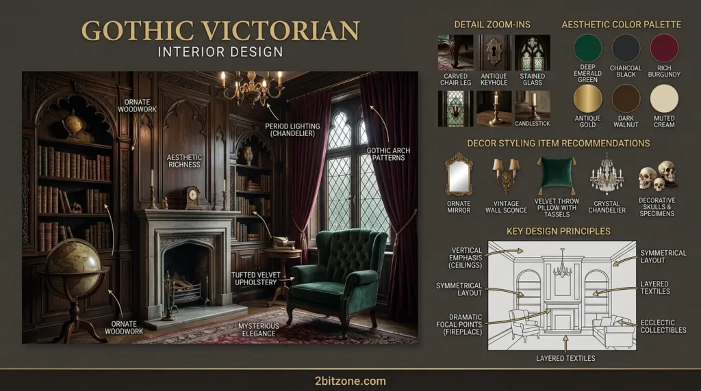
Dark, ornate, and romantic. Gothic Victorian living room paint colors use deep purples, blood reds, and black with gold trim.
- Why It’s Trending: Wednesday Addams made dark, romantic interiors cool again.
- Why Homeowners Love Them: Extreme coziness for people who hate beige.
- Best Features: Deep, dark colors make ornate plasterwork disappear (in a good way).
- Smart Features: Black walls hide soot from fireplaces and candle smoke.
- Key Characteristics: Arches, turrets, velvet drapes, taxidermy (faux).
- Main Design Elements: Wingback chair, canopy, gasolier (electric candle chandelier).
- Common Materials: Velvet, damask, wrought iron, mahogany, stained glass.
- Best Colors: Eggplant, burgundy, charcoal, black, gold (metallic accents).
- Popular Features: Stenciled damask pattern painted onto a solid wall.
- Styling Tips: Use gold metallic paint on your trim for a rich, Victorian look.
- Best Decor Pairings: Candlesticks, ravens (decorative), vintage books.
- Works Best With: Heavy drapes and dim, warm lighting.
- Best Room Match: Libraries, studies, parlor-style living rooms.
- Ideal Spaces: Victorian homes, gothic mansions, Halloween lovers’ homes.
- Perfect For: Writers, musicians, spooky season enthusiasts (year-round).
- Benefits: Dramatic, unique, surprisingly warm and snug.
25. Tropical Modern
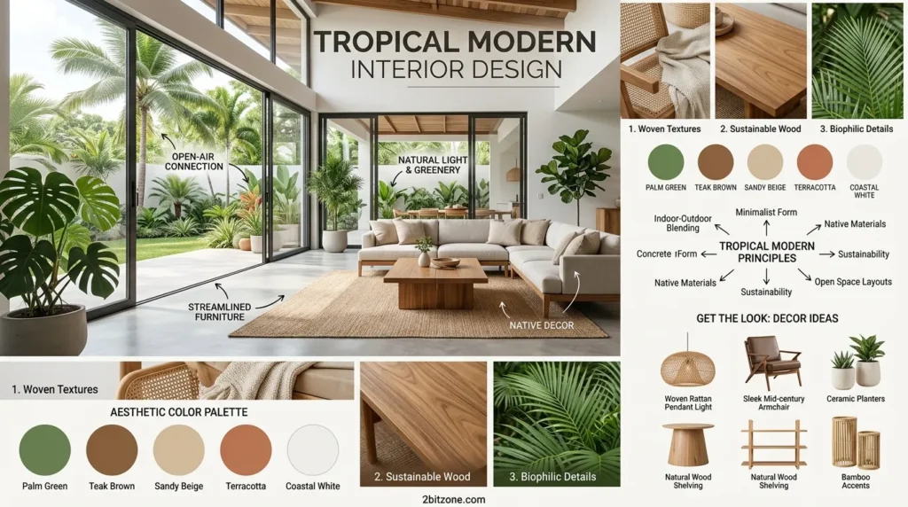
Lush, vibrant, and airy. Tropical modern living room paint colors mix bright greens, ocean blues, and crisp whites.
- Why It’s Trending: People want their homes to feel like a luxury resort.
- Why Homeowners Love Them: Makes even a rainy day feel like vacation.
- Best Features: Bright, saturated colors make a room feel energized.
- Smart Features: High-gloss white trim reflects the green of surrounding plants.
- Key Characteristics: Large leafy plants, natural stone, open air.
- Main Design Elements: Rattan daybed, cane webbing, bamboo blinds, tiki torches.
- Common Materials: Teak, seagrass, slate, ceramic, outdoor fabric indoors.
- Best Colors: Palm green, ocean blue, hibiscus pink (small accent), crisp white.
- Popular Features: A leafy mural painted on one wall or a jungle stencil.
- Styling Tips: Paint your ceiling a pale sky blue for an outdoor feel.
- Best Decor Pairings: Tiki mugs, monstera leaves, pineapple lamps.
- Works Best With: Sliding glass doors that open to a patio.
- Best Room Match: Sunrooms, pool houses, beach condos.
- Ideal Spaces: Florida homes, Hawaiian bungalows, LA apartments.
- Perfect For: Vacation rental owners, plant collectors, warm-weather lovers.
- Benefits: Energizing, Instagram-bright, feels like an escape.
FAQs
1. What are the most popular living room colors for 2026?
The latest trend is “grounded neutrals” and continue the movement of “nature-inspired tones”. Top picks for 2026 include:
- Mushroom Neutrals: The softest and most soulful blend of taupe, greige, and beige.
- Moody Greens & Blues: Essex Green and Sea Mariner are shades full of depth and sophistication.
- The warm whites and earth tones: Creamy beiges, soft clay tones and palm greens replace stark, cool grays.
2. How do I choose the right paint color for my space?
Some designers recommend that you wait to pick your paint last. Pick your base, first…well, pick your anchor pieces like your sofa and rug and flooring…then find a paint color that works out the undertones of those colors. Identifying these undertones uses a neutral color wheel, and you can find tools of that nature on amazon.
3. Which colors make a small living room look bigger?
- Cool Tones: Light blue and green have shorter wavelengths that settle back behind, while the wall feels farther away.
- Light neutrals: Off-whites and light grays are more reflective, making them feel airy.
- Color Drenching – This is the idea behind painting the walls, ceiling and woodwork in the same shade to “blur” the boundaries of a room so it feels more spacious.
4. What is the “60-30-10” rule for paint?
This is a classic design rule to balance your palette:
- 60% is your main color (usually the walls)
- Your secondary is 30% (a feature wall or covering).
- Accent color (decor, pillows or trim) — 10%
5. How does natural light affect paint color?
One color may look completely different in terms of orientation of the room:
- A north facing room gives a “cool” light, warm toned paints can help balance it out.
- South-facing: Very hot, vivid light that will work for chroma, but the pastels may wash out here.
6. What is LRV and why does it matter?
LRV or light reflectance value is a measurement of how much light is reflected off a color. With living rooms, many prefer to sit between 60 and 80 LRV so the space feels bright and airy.
7. Should I use a matte, eggshell, or satin finish?
- Matte: Good for hiding wall imperfections, and reduces glare in bright rooms.
- Eggshell/Satin: Most widely used for living rooms as they are durable, easy to clean, and give a soft glow.
8. Are gray living rooms still in style?
Though “clinical” grays are giving way to warmer alternatives (such as Rare Gray), superficially cool colors remain the go-to minimalist hybrid viable for pairing with wood tones.
9. What color goes best with a brown sofa?
In order to build an overall harmony and natural appearance, designers usually recommend the pink beige or warm shades neutral would go well against brown leather or fabric used in Earth.
10. How can I make my living room feel “cozy”?
- Warm Neutrals, such as “Baby Fawn” channel hygge — the Danish and Norwegian word for coziness.
- Darker Shades: Dark colors, like deep greens or navy can “wrap” a room the way a blanket wraps your body and will make larger spaces feel cozier.
11. Can I use an accent wall in a modern living room?
Yes. While the entire color palette for 2023 is hot and no one is ready to move on, taking a moody tone with a single accent wall in dark navy, forest green or charcoal remains popular as we find the right place to hang our focus — behind that TV or fireplace!
12. How many colors should I use in one room?
In most cases, use three main colors to prevent an overwhelming look: one primary color on the walls; two for accents.
Final Thoughts
Your living room colors are not just a house coat and the deciding personality trait of your home. But the best color is any color that brings a smile to your face when you come walk through. Don’t rush the process. Try out some test samples, see how light travels through the room and trust your instincts.
Remember: Paint is temporary. If you don’t like it, it’s just paint so paint over it. However, following the tips and palettes above puts you way ahead of 90% of DIY-ers. So pick up those paint swatches, crack open the window and begin your space overhaul today. Your almost-dream living room is just a roller stroke away.